")
For Users
Installation of Paid Version
Plugin installation Method 1:
- Download the plugin using your BeRocket account.
- Disable FREE version of the plugin.
- Open the Admin Bar of your site and go to Plugins→ Add new→ Upload plugin.
- Click on Browser Dialog to open it, select downloaded zip-file, and click on Install.
- Click on Activate.
Plugin installation Method 2:
- Download plugin using your BeRocket account.
- Disable FREE version of that plugin.
- Access your website using FTP.
- Go to WordPress/wp-content/plugins folder.
- Open downloaded zip-file to unzip its content and copy unzipped files to WordPress/wp-content/plugins folder.
- Open the Admin Bar of your site and go to Plugins.
- Find Plugin and click on Activate.
Plugin Key
BeRocket Plugin Key are used for an auto-update of plugins from BeRocket site.
Where do I find the Product Key?
- Open BeRocket site and log in (the Login button is in the header menu).
- Go to My Account (the My Account button is in the header menu).
- Click on the key icon on the right side from the plugin name WooCommerce Advanced Product Labels:
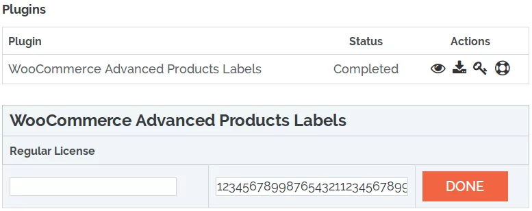
- You can click on Product Key and copy it.
- You can enter any notice for the key in the left-field and click DONE to save.
Plugin Key Activation
To enter the Plugin Key, open the Admin Bar of your site and click on BeRocket→ Account Key.
How do I activate the Plugin Key?
- Copy the Plugin Key from BeRocket site.
- Enter the key into the WooCommerce Advanced Product Labels field.
- Click on Test.
- If you use the right Plugin Key, you will see:
- Click on the Save Changes button.
Settings
To find the WooCommerce Grid/List View settings follow Admin Bar→ WooCommerce→ Grid/List View.
- Buttons
- Product Count
- List Style
- Custom CSS/ Javascript
Buttons
Contains settings for customizing grid/ list buttons.
- Default style:
- Grid
- List
- Mobile default style:
- Grid
- List
- Fixed style for page:
- Page
- [SITE HOME]
- [WOO SHOP]
- [WOO CATEGORIES]
- [WOO PRODUCTS]
- Blog
- Cart
- Checkout
- Compare
- Knowledge Base
- My account
- Sample Page
- Shop
- Welcome
- View
- Grid
- List
- On:
- Mobile & Desktop
- Mobile
- Desktop
- Add Page (adds a page based on the settings above).
- Page
- Max mobile width – grid/list width in px.
- Custom class – custom class removes all style from grid/list button and adds this class.
- Buttons display – where buttons will be displayed.
- Above order by menu
- Under order by menu
- Above pagination
- Buttons position – buttons will be displayed on the left/right side.
- Paddings – paddings for grid/list buttons in pixels:
- Under buttons (px)
- Above buttons (px)
- Before buttons (px)
- After buttons (px)
- Shortcode:
- [br_grid_list]
- title – title before buttons
- position – “”, “left” or “right”. Leftside or rightside position of buttons.
- all_page – 1 or 0, displays on any page or only on shop and categories pages.
- [br_grid_list]
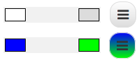
Presets – contains ready to use styles for buttons.

Detailed Presets – contains some predefined settings styles for buttons.
.png)
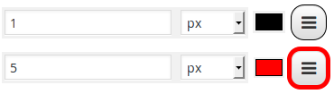
All changes you can see in the right bottom corner in preview for normal, mouse over and selected button states.

For more specific stylization, use blocks under the blocks of presets.
Buttons style
Styles for all button types: normal, mouse over and selected (px/em/%/initial/inherit).

Normal buttons style, Mouse over button style and Selected buttons style have same fields but for buttons in different states.
- Background color
- Border width and color
- Box shadow Change this only if you know how CSS3 box-shadow works.


All settings can be Set to default.
Product Count
Contains settings for customization product count per page links.
- Use products count – show links for changing products count per page.
- Custom class for buttons – removes all style from products count links and adds this class.
- Default Products Per Page – default products count per page.
- Product count value – list of products count links (Note: you can use digits and “all” (example:”12,24,48,all”); maximum products for “all” is 400. If you have more products “all” will be 400).
- Spliter value – symbol or string between products count links.
- Text – text before and after products count links.
- Buttons display – where links will be displayed:
- Above order by menu
- Under order by menu
- Above pagination
- Before Grid/List buttons
- After Grid/List buttons
- Under Grid/List buttons
- Product count position – links will be on the left side or right side.
Buttons style
- Button width – width for every product count link (em/px/%/initial/inherit).
- Button height – height for every product count link (em/px/%/initial/inherit).
- Text size – text size for links (em/px/%/initial/inherit).
- Line height – line height for links (em/px/%/initial/inherit).
Normal buttons style, Mouse over buttons style and Selected buttons style have same fields but for links with different state.
- Text color – text color for link with this state
- Border width – border width fo link with this state (em/px/%/initial/inherit).
- Border color – border color fo link with this state
Spliter style
Stylization for spliter.
- Text color – color of spliter between links.
- Border width – spliter border width (em/px/%/initial/inherit).
- Border color – spliter border color.
- Padding before – padding between left side link and spliter (em/px/%/initial/inherit).
- Padding after – padding between right side link and spliter (em/px/%/initial/inherit).
Text style
Stylization for text before and after links.
- Text color – color of text.
- Border width – border width for before and after links text (em/px/%/initial/inherit).
- Border color – color of the border.
- Padding before – padding before text (em/px/%/initial/inherit).
- Padding after – padding after text (em/px/%/initial/inherit).
List Style
You can use Simple style or Advanced style of list.
Simple list style
- You can edit only additional information that is placed on the right side from an image.
- The Image and Add to cart button are used in default grid view.
Preview for list style additional information is shown on the right side of the page.

You can edit any element that is highlighted with yellow color when mouse over element.

Click on highlighted element to edit.
Advanced list style
- You can edit any element of list style.
- Have predefined templates for easier list stylization.
Preview for list style is shown on the right side of the page.

You can edit any element that is highlighted with yellow color when mouse over element.

All that you can edit will be display on the left side.

CSS/JavaScript
Contains setting to set custom CSS/JavaScript code that will be added to frontend pages.
- Disable Font Awesome: do not upload the CSS file for Font Awesome to the site. Disable it only if you do not use Font Awesome icons in widgets or you have Font Awesome in your theme.
- Font Awesome Version – version of Font Awesome, which will be used in the settings and the front end pages of the shop. Please select the version that is in your theme.
- Custom CSS – field for custom CSS; contains custom CSS code settings to be displayed on the front end pages. Custom CSS is the CSS as you want it to be.
- JavaScript before list or grid style set
- JavaScript after list or grid style set
- JavaScript after list style set
- JavaScript after grid style set
- JavaScript before cookies get
- JavaScript after cookies get
- JavaScript before selected buttons Grid/List changed
- JavaScript after selected buttons Grid/List changed
- JavaScript before selected product count links changed
- JavaScript after selected product count links changed
- JavaScript before page reload on product count change
- JavaScript before AJAX page reload on product count change
- JavaScript after AJAX page reload on product count change (works only if WooCommerce AJAX Products Filter is installed)
Settings per-theme
Avada
Custom CSS Settings
Open the Admin Bar of your site and follow WooCommerce→ Products Labels→ Custom CSS.
Add this CSS to the field “User custom CSS style”:
li.product.berocket_lgv_list div.product-details
{
    display: none !important;
}
X
Custom CSS Settings
Open the Admin Bar of your site and follow WooCommerce→ Products Labels→ Custom CSS.
Add this CSS to the field “User custom CSS style”:
.woocommerce-page ul.products .product.berocket_lgv_list div.entry-product,
.woocommerce-page ul.products .product.berocket_lgv_list div.entry-product div.entry-featured,
.woocommerce-page ul.products .product.berocket_lgv_list div.entry-product div.entry-wrap
{
    margin-bottom: 0px;
}
li.product.berocket_lgv_list div.entry-product div.entry-wrap
{
    padding: 0px 15px;
}
For Developers
Action Hooks
includes/functions.php
br_get_woocommerce_version()
Public function to get WooCommerce version
return string. woocommerce version
br_lgv_get_cookie($position)
Public function to get WooCommerce version
- $position – 0 or 1. 0 – list/grid, 1 – product count per page
return string.
woocommerce-list-grid-view.php
All of these functions are in the BeRocket_LGV class as static functions.
init ()
Function for initializing scripts and adding buttons.
set_styles ()
Function for setting user styles in the plugin settings.
additional_product_data ()
Function for adding additional settings for page for using in list style.
br_get_template_part( $name = ” )
Get template part (for templates like the slider).
Place default templates in the plugin folder
woocommerce-grid-list-view/templates.
To rewrite the template in your theme folder create folder with name woocommerce-list_grid and places new template with identical name in this folder.
show_buttons_fix ()
Displays Grid/List button.
show_product_count_fix ()
Displays product count links.
register_lgv_options ()
Adds option page to admin menu.
activation ()
Adds settings on plugin activation.
deactivation ()
Removes all settings in the plugin.
Filter Hooks
berocket_lgv_user_func
You can change or add JavaScript to specific actions. All these functions can be added by users in the plugin settings.
Parameters
- user_func – array with users JavaScript functions, that can be set in plugin settings
- before_style_set – script before list or grid style set
- after_style_set – script after list or grid style set
- after_style_list – script after list style set
- after_style_grid – script after grid style set
- before_get_cookie – script before cookies get
- after_get_cookie – script after cookies get
- before_buttons_reselect – script before selected buttons List/Grid changed
- after_buttons_reselect – script after selected buttons List/Grid changed
- before_product_reselect – script before selected product count links changed
- after_product_reselect – script after selected product count links changed
- before_page_reload – script before page reload on product count change
- before_ajax_product_reload – script before AJAX page reload on product count change
- after_ajax_product_reload – script after AJAX page reload on product count change
Usage
<?php
function change_berocket_lgv_user_func ( $user_func ) {
//your code here
    return $user_func;
}

add_filter( 'berocket_lgv_user_func', 'change_berocket_lgv_user_func' );
?>
lgv_product_data_template
Template name for the list style.
Parameters
- template_name – current template name, used by default: ‘additional_product_data_advanced’ and ‘additional_product_data’
Usage
<?php
function change_lgv_product_data_template ( $template_name ) {
//your code here
    return $template_name;
}

add_filter( 'lgv_product_data_template', 'change_lgv_product_data_template' );
?>
lgv_product_classes
Classes for products which contain the list style.
Parameters
- classes – all classes that will be added to product.
Usage
<?php
function change_lgv_product_classes ( $classes ) {
//your code here
    return $classes;
}

add_filter( 'lgv_product_classes', 'change_lgv_product_classes' );
?>
lgv_get_template_part
Template which is used in the plugin.
Parameters
- template – link to template that will be loaded.
- name – template name.
Usage
<?php
function change_lgv_get_template_part ( $template, $name ) {
//your code here
    return $template;
}

add_filter( 'lgv_get_template_part', 'change_lgv_get_template_part', 10, 2 );
?>
lgv_buttons_position
Position for button to change grid/list style, can be ‘left’ or ‘right’.
Parameters
- position – current position from plugin settings.
Usage
<?php
function change_lgv_buttons_position ( $position ) {
//your code here
    return $position;
}

add_filter( 'lgv_buttons_position', 'change_lgv_buttons_position' );
?>
lgv_buttons_padding
Paddings around the button to change grid/list style.
Parameters
- paddings – array with paddings:
- top – padding from top
- bottom – padding from bottom
- left – padding from left
- right – padding from right
Usage
<?php
function change_lgv_buttons_padding ( $paddings ) {
//your code here
    return $paddings;
}

add_filter( 'lgv_buttons_padding', 'change_lgv_buttons_padding' );
?>
lgv_buttons_custom_class
Custom class for button to change grid/list style.
Parameters
- class – string with custom class.
Usage
<?php
function change_lgv_buttons_custom_class ( $class ) {
//your code here
    return $class;
}

add_filter( 'lgv_buttons_custom_class', 'change_lgv_buttons_custom_class' );
?>
lgv_buttons_template
Template name for button to change grid/list style.
Parameters
- template – string with template name.
Usage
<?php
function change_lgv_buttons_template ( $template ) {
//your code here
    return $template;
}

add_filter( 'lgv_buttons_template', 'change_lgv_buttons_template' );
?>
lgv_product_count_position
Position for product count links, can be ‘left’ or ‘right’.
Parameters
- position – current position from plugin settings.
Usage
<?php
function change_lgv_product_count_position ( $position ) {
//your code here
    return $position;
}

add_filter( 'lgv_product_count_position', 'change_lgv_product_count_position' );
?>
lgv_product_count_custom_class
Custom class for product count links.
Parameters
- class – string with custom class.
Usage
<?php
function change_lgv_product_count_custom_class ( $class ) {
//your code here
    return $class;
}

add_filter( 'lgv_product_count_custom_class', 'change_lgv_product_count_custom_class' );
?>
lgv_product_count_template
Template name for product count links.
Parameters
- template – string with template name.
Usage
<?php
function change_lgv_product_count_template ( $template ) {
//your code here
    return $template;
}

add_filter( 'lgv_product_count_template', 'change_lgv_product_count_template' );
?>
lgv_product_count_values
Values for product count links.
Parameters
- values – string values (delimiter: , ). Example: “12,24,48,all”.
Usage
<?php
function change_lgv_product_count_values ( $values ) {
//your code here
    return $values;
}

add_filter( 'lgv_product_count_values', 'change_lgv_product_count_values' );
?>
lgv_widget_title
Title for widget with buttons.
Parameters
- title – string with title.
Usage
<?php
function change_lgv_widget_title ( $title ) {
//your code here
    return $title;
}

add_filter( 'lgv_widget_title', 'change_lgv_widget_title' );
?>
lgv_widget_custom_class
Custom class for button to change grid/list style in widget.
Parameters
- class – string with custom class.
Usage
<?php
function change_lgv_widget_custom_class ( $class ) {
//your code here
    return $class;
}

add_filter( 'lgv_widget_custom_class', 'change_lgv_widget_custom_class' );
?>
lgv_widget_template
Template name for button to change grid/list style in widget.
Parameters
- template – string with template name.
Usage
<?php
function change_lgv_widget_template ( $template ) {
//your code here
    return $template;
}

add_filter( 'lgv_widget_template', 'change_lgv_widget_template' );
?>
Files
- woocommerce-list-grid-view.php – main plugin file
- css – folder with CSS files
- admin_lgv.css – styles for admin panel
- colpick.css – styles for color picker block
- font-awesome.css – standard Font Awesome styles
- shop_lgv.css – front end styles
- fonts – Font Awesome fonts
- includes – folder with additional PHP files
- functions.php – public functions
- updater.php – BeRocket Updater for plugins update from BeRocket site
- widget.php – widget for Grid/List buttons
- js – folder with JavaScript files
- admin_lgv.js – JavaScript for admin panel settings
- colpick.js – JavaScript for color picker in admin panel settings
- grid_view.js – JavaScript for front end
- jquery.cookie.js – jQuery plugin for cookie
- templates – templates for settings, list style and buttons
- additional_product_data.php – templates for simple list style
- additional_product_data_advanced.php – templates for advanced list style
- buttons_settings.php – template for Buttons tab in settings
- css_settings.php – template for CSS tab in settings
- javascript_settings.php – template for JavaScript tab in settings
- license_settings.php – template for License tab in settings
- list-grid.php – template for button for change grid/list style
- liststyle_settings.php – template for List Style tab in settings
- product_count.php – template for product count links
- product_count_settings.php – template for Product Count tab in settings
- settings.php – main plugin settings page