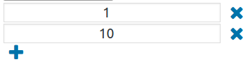
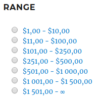
Setting ranges (Only for Attribute – Price, Type – Range)
Hide the first and last ranges without products – if the first and / or last range does not have products, they will be hidden (Only for Attributes – Price, Type – Range)
Show the last range to the infinity – instead of the last price in the range, an infinity sign will be displayed (Only for Attributes – Price, Type – Range)
Disable multiple selection? – when the setting is on, only one value can be selected
Drop-down multiple selection – when this option is enabled, you can select multiple attributes from the drop-down
Text before/after the price – the text that will be displayed before / after the price
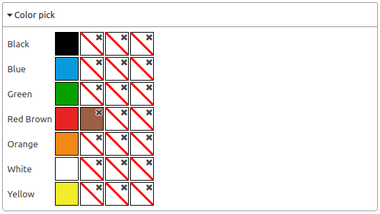
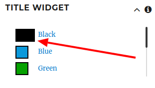
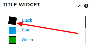
Color selection – instead of the attribute name, you can display a color, you can select multiple colors per attribute (Only for Type – Color)
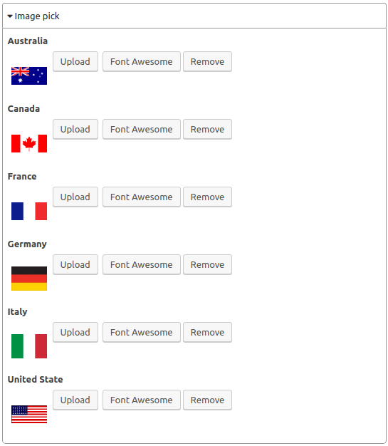
Image selection – instead of the attribute name, you can display a picture, you can upload your picture or select Font Awesome (Only for Type – Picture)
Use current product category to get child categories
Depth level – depth of the category tree
Product category – you can choose which category to display
Number of attribute values
Show/Hide Button
Enable collapse option – when the setting is enabled, the widget can be minimized
Minimize this widget when loading – when the setting is enabled, when the page loads, the widget will be minimized
Show products number for each attribute value – when the setting is enabled, the number of products with attributes or categories will be displayed
Hide arrow to collapse widget – when the setting is enabled, the arrow to minimize the widget will not be displayed
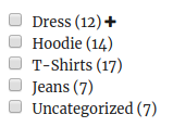
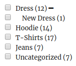
Show hierarchical values as a tree with hidden child values on load?
Values per row – number of attributes per row
Display value name with color/image – when the setting is on, the attribute/category name will also be displayed (only for Type – Color/Image)
Block size (Height x Width) – set the block size of the color/picture (Only for Type – Color/Image)
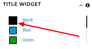
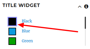
Selection style – option to display the selected value (Only for Type – Color/Image)
Default
Rotate – rotate the selected item
Scale – zoom in on the selected item
Blue Shadow – a blue shadow around a selected item
Custom CSS – custom CSS for the selected item
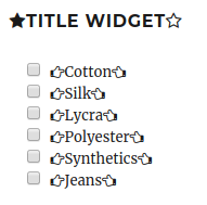
Icons – you can set icons near the title/widget value
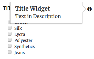
Description – description for the widget
CSS class – setting a CSS class
Use min price
Use max price
Filter Block Height – the height of the filter widget
Scrollbar Theme – styles for scrolling widget
Child/Parent Limitation – child/parent limitation
Disabled
Child Count
Parent
Child
Values Restriction by Category
values selected in the “Include/Exclude” list – display/not display selected values


