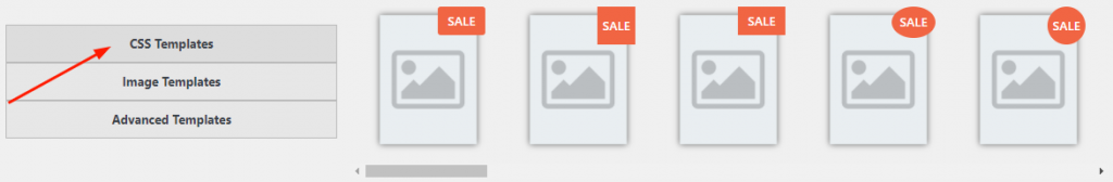
- CSS Templates
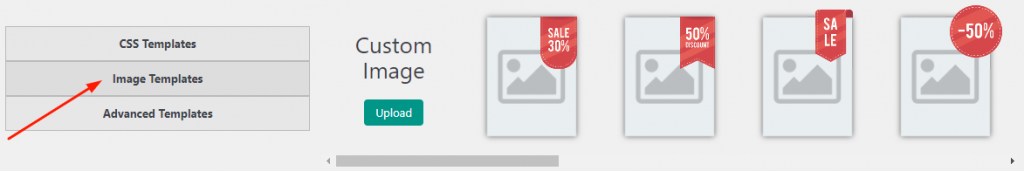
- Images Templates
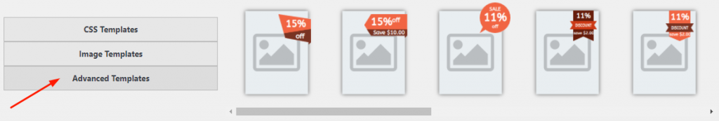
- Advanced Templates


- Hide on:
- Mobile
- Tablet
- Desktop
- Content type – a type of label content:
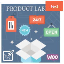
- Text – block of text with a background color.
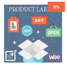
- Discount percentage – block of text (percentage of discount) with a background color.
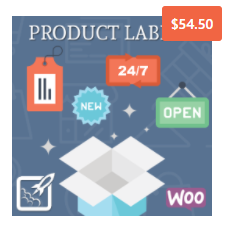
- Price – a block with text (product price) and colored background.
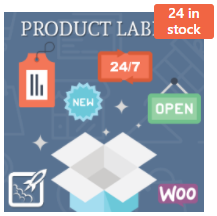
- Stock status – displays the availability of goods in stock.
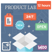
- Time left for discount – block of text (time left for discount) with a background color.
- Discount amount – a block with text (discount amount) and color background.

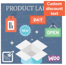
- Custom discount text.
- Product attribute – use attributes in the form of labels (text, color, or image).
- Discount percentage:
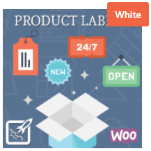
- Background Picture – allows you to upload (or remove) an image from the library to the label background.
- Text Before – text, that will be displayed before the discount percentage (New Line – text that will be displayed in another line).
- Text After – text, that will be displayed after the discount percentage (New Line – text that will be displayed in another line).
- Use the minus symbol – if the setting is enabled the minus symbol will be displayed before the discount percentage.
- Price:
- Background Picture – allows you to upload (or remove) an image from the library to the label background.
- Text Before – text, that will be displayed before the product price (New Line – text that will be displayed in another line).
- Text After – text, that will be displayed after the product price (New Line – text that will be displayed in another line).
- Stock Status:
- Background Picture – allows you to upload (or remove) an image from the library to the label background.
- Text Before – text, that will be displayed before the stock status (New Line – text that will be displayed in another line).
- Text After – text, that will be displayed after the stock status (New Line – text that will be displayed in another line).
- Time left for discount:
- Background Picture – allows you to upload (or remove) an image from the library to the label background.
- Text Before – text, that will be displayed before the time left for discount (New Line – text that will be displayed in another line).
- Text After – text, that will be displayed after the time left for discount (New Line – text that will be displayed in another line).
- Discount amount:
- Background Picture – allows you to upload (or remove) an image from the library to the label background.
- Text Before – text, that will be displayed before the discount amount (New Line – text that will be displayed in another line).
- Text After – text, that will be displayed after the discount amount (New Line – text that will be displayed in another line).
- Use the minus symbol – if the setting is enabled the minus symbol will be displayed before the discount amount.
- Custom discount text:
- Background Picture – allows you to upload (or remove) an image from the library to the label background.
- Text – the text that will be displayed on the label.
- Replacements:
%sale_p% – Discount percentage
%sale_val% – Discount amount
%sale_end% – Time left for discount
%sale%ANYTEXT%sale% – Display ANYTEXT only if a product with discount
%nsale%ANYTEXT%nsale% – Display ANYTEXT only if a product without discount - Text Before – text, that will be displayed before the custom discount text (New Line – text that will be displayed in another line).
- Text After – text, that will be displayed after the custom discount text (New Line – text that will be displayed in another line).
- Product attribute:
- Text Before – text, that will be displayed before the product attribute (New Line – text that will be displayed in another line).
- Text After – text, that will be displayed after the product attribute (New Line – text that will be displayed in another line).
- Attribute:
- Attribute values – select an attribute or a category to display on a label.
- Display the first available value.
- Attribute data type – allows you to select the time of attribute data output.
- Text.
- Color.
- Image.
- Text – block of text with a background color.
- Link – opens a new page when a user clicks on the label (available only if the Advanced Content add-on is enabled: BeRocket→ Product Labels→ Setting→ Add-ons→ Advanced Content)):
- Open in a new tab.
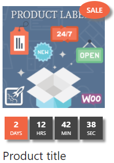
- Use timer – enable/disable the product timer with a temporary discount (can be enabled with the add-on on: BeRocket→ Product Labels→ Settings→ Add-ons→Timer)
- Large – select a big timer style;
- Compact – select a small timer style;
- Paddings – paddings around a timer; CSS units – px|em|%;
- Show leading zeros – show 0 in front of days/hours/minutes/seconds
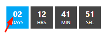
- Use opacity – if opacity is set in the Style tab settings, then it will also be applied to the timer
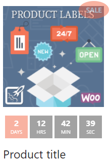
- Use shadow – if shadow is set in the Style tab settings, then it will also be applied to the timer