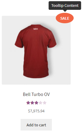
- Content – allows you to add text, which will be shown in the Tooltip.
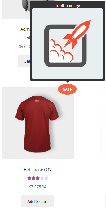
- Tooltip image:
- No image
- Upload
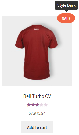
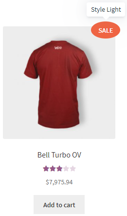
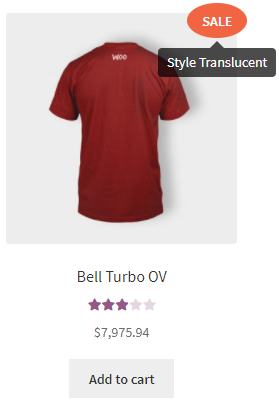
- Style:
- Dark
- Light
- Translucent
- Dark
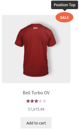
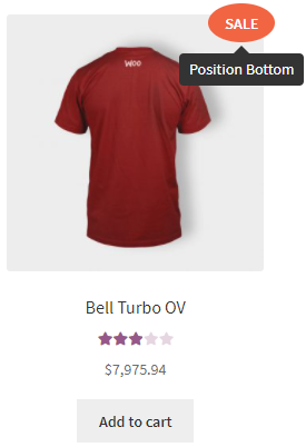
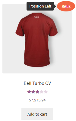
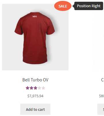
- Position – allows you to choose where the tooltip should appear:
- top
- bottom
- left
- right
- top
- Open delay– set how long it will take to open a tooltip [ms]
- Close delay – set how long it will take to close a tooltip [ms]
- Open on – allows you to select the condition to display the tooltip (* if a label has a link, tooltip will always open on hover):
- click – when you click with the cursor on the label.
- hover – when you hover the cursor on the label.
- Close on click everywhere – when enabled, a tooltip will close by clicking anywhere.
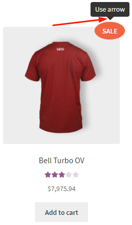
- Use arrow – allows you to show the arrow for a tooltip.
- Max width – allows you to set the maximum width for a tooltip.


