Contains settings for customizing grid/ list buttons.
- Default style:
- Grid
- List
- Mobile default style:
- Grid
- List
- Fixed style for page:
- Page
- [SITE HOME]
- [WOO SHOP]
- [WOO CATEGORIES]
- [WOO PRODUCTS]
- Blog
- Cart
- Checkout
- Compare
- Knowledge Base
- My account
- Sample Page
- Shop
- Welcome
- View
- Grid
- List
- On:
- Mobile & Desktop
- Mobile
- Desktop
- Add Page (adds a page based on the settings above).
- Page
- Max mobile width – grid/list width in px.
- Custom class – custom class removes all style from grid/list button and adds this class.
- Buttons display – where buttons will be displayed.
- Above order by menu
- Under order by menu
- Above pagination
- Buttons position – buttons will be displayed on the left/right side.
- Paddings – paddings for grid/list buttons in pixels:
- Under buttons (px)
- Above buttons (px)
- Before buttons (px)
- After buttons (px)
- Shortcode:
- [br_grid_list]
- title – title before buttons
- position – “”, “left” or “right”. Leftside or rightside position of buttons.
- all_page – 1 or 0, displays on any page or only on shop and categories pages.
- [br_grid_list]
Presets – contains ready to use styles for buttons.

Detailed Presets – contains some predefined settings styles for buttons.
.png)
All changes you can see in the right bottom corner in preview for normal, mouse over and selected button states.

For more specific stylization, use blocks under the blocks of presets.
Buttons style
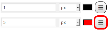
Styles for all button types: normal, mouse over and selected (px/em/%/initial/inherit).

Normal buttons style, Mouse over button style and Selected buttons style have same fields but for buttons in different states.
- Background color
- Border width and color
- Box shadow Change this only if you know how CSS3 box-shadow works.


All settings can be Set to default.